Graphs and charts provide highly visual representations of data sets. They can take many forms (e.g., line, bar, column, pie, pictograph). Each graph/chart type is best suited to satisfy a particular need.
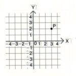
Other than pie charts, all graphs are shown on a coordinate grid. This means that you need an ordered pair or (X,Y) coordinate set to plot the data points. On graph paper, X is the horizontal axis and Y is the vertical axis. Most students are used to data plots given by (4,5) as meaning the X coordinate is 4 and Y coordinate is 5. Typically the X-axis represents the independent variable and the Y-axis the dependent variable. Thus, when data is present in other ways (e.g., in 1995, the average person earned $20,000), the coordinates become (1995, $20,000).
TYPES OF GRAPHS / CHARTS
Line graphs show us how things change, typically as TIME changes. In the example above, salary changes, but only as the years change. This is why TIME often runs along the X-axis.
Bar graphs let us compare one variable to another.
Pie charts let us take a whole and examine its parts (either in number and/or percentage form).
Examples of several graph types are shown in Figure 1.
SCALING THE DATA
When you are given a data set to plot, it becomes important to determine the proper scale over which to spread the graph. This includes both X- and Y-axes. Otherwise, the data may be plotted in a tiny area of the graph, making it harder to read.
To determine the scale (both horizontally and vertically), you need to first determine the domain and range of your data. Recall that domain refers to the difference between highest and lowest values along the X-axis while the range refers to the difference between highest and lowest values along the Y-axis. In general number (not graphing) usage, range refers to the difference between highest and lowest values in a data set.
Next count the number of squares you have in each direction.
Divide the domain by the number of X squares and the range by the number of Y squares.
This tells you how much each square is worth for each of the X and Y directions. Although we are using squares (and we expect each side to be exactly the same), it is okay for each directional grid size value to be different when we are graphing.
But what do you do when your square value or scale comes out to be 7.9 units? You don’t want to plot each successive square as 7.9, 15.8, 23.7, etc. You want it in a form that becomes easy to keep track of and account for as you plot your data.
So, whatever values you obtain for scale, round them UP (not DOWN) to an easy-to-use number. Do this for both the domain and range values.
Note, too, that you do NOT have to start a graph in either the X or Y direction at zero (see Fig. 3).
Figure 2 is a sample data set.
If the domain in your data set is 1400 years and you have 22 spaces horizontally on your graph paper, then your scale will be 64; rounding up to 100 is not unreasonable. With a range of 87 (and 15 spaces) your Y-scale will be 5.8; rounding to 10 will severely limit the spacing for the graph. Instead, round to a value of 6, such that every group of 5 squares counts as 30. You can even label your graph every 5th position as 30-60-90. Be sure that your put a label on each axis (and/or a legend or key) so anyone reading your graph will be able to tell what everything means. Sometimes, the title of the graph serves as the Y-axis legend (as shown here).
Your data set, when plotted, will look like this (Fig. 3). While it is customary to connect the plotted points on a line graph, sometimes, it is more important not to and let the reader see the shape for himself/herself. If you do “connect the dots,” be sure your dots are larger than the thickness of the line by which you connect them. You don’t want the points to be hidden. Here we used diamond-shaped “dots.”
HARD TO PLOT OR UNUSUAL DATA
Sometimes, data is not provided in integer form or the data is not provided at nicely spaced intervals. In these situations, you need to be more careful in plotting the data.
For data that doesn’t fit exactly on grid coordinates, you need to interpolate to find the exact place to plot your data point. This can involve X- and/or Y- directional interpolation.
For example, if your grid lines in the X-direction are spaced every 20 units and there is a value of 50, it would be plotted halfway between 40 and 60. If the value were 45, it would be 1 of 4 five-unit spaces between 40 and 60 (i.e., 40, 45, 50, 55, 60). One of these spaces is 40-45. So, the point would lie ¼ of the way between 40 and 60, starting from 40.
You can also compute the spacing as 5 units out of 20 or 5/20 or ¼.
If each grid line is 1 unit and you have a value of ¼, then this value would like ¼ of the way between zero and one.
If data are provided at unusually spaced points, then plot the data where it should be plotted on your graph or chart. Just be sure that when you create your graph or chart, you follow the rules described earlier for creating the X- and Y-axes. Do NOT try to just plot the data at each X-coordinate!
PRACTICE A LOT
It will take practice to learn how to graph data correctly and effectively. But once you understand the process, you will be able to easily plot data and also more easily interpret it. So, practice, practice and practice some more.


